South East Wood Fuels rebrand
From forest to warmth
South East Wood Fuels were one of the first biomass companies to supply sustainable wood chip for heating systems. Now working in a competitive landscape they needed a visual identity that clearly communicated their unique offer.
The creative brief for this project came from the outcomes of a strategy and story-telling workshop. Stories were shared between colleagues of times when they had gone to great measures to help their customers. The three themes ‘Local, expert and quality’ emerged and has inspired the visual and verbal identity and logo concept.
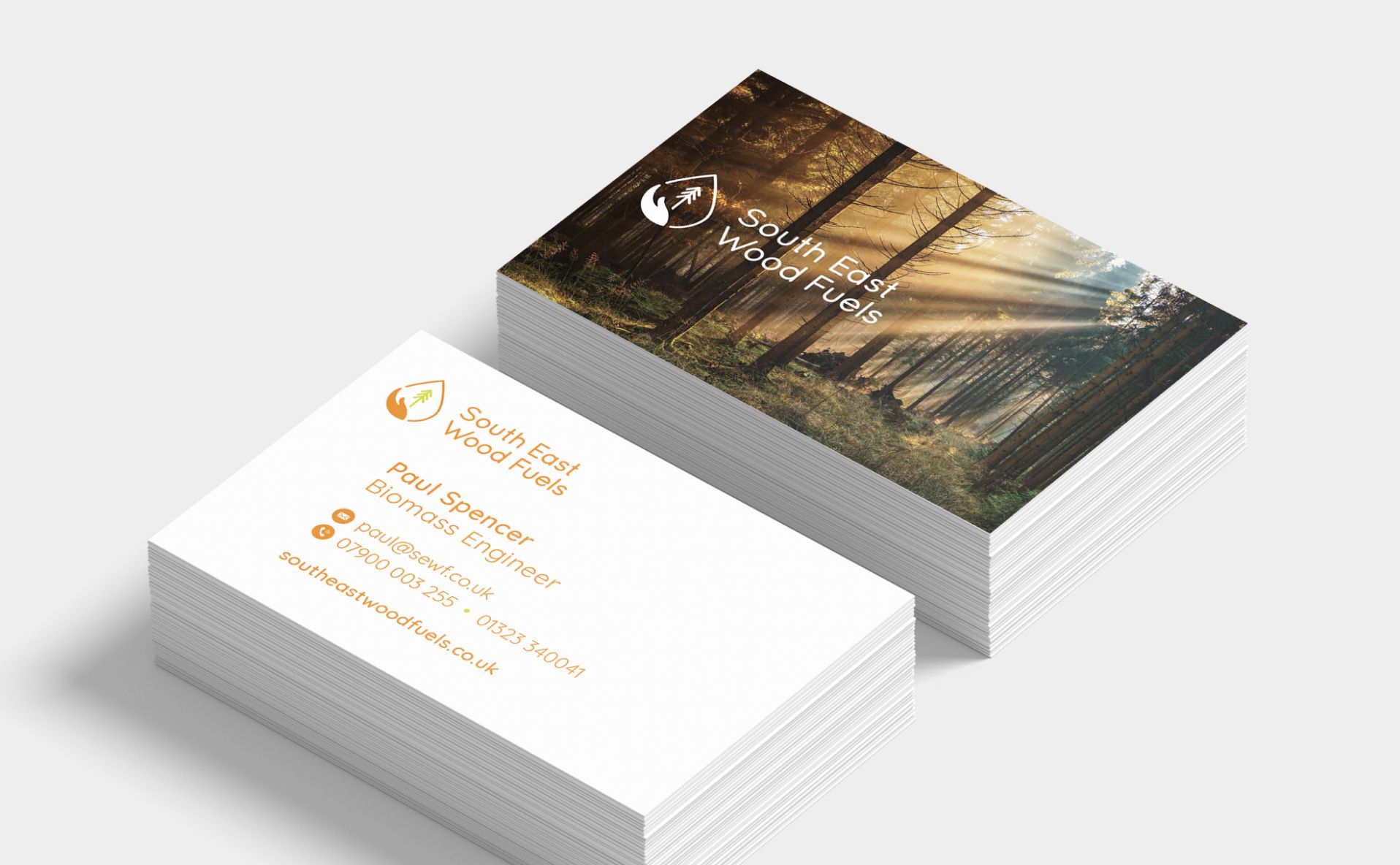
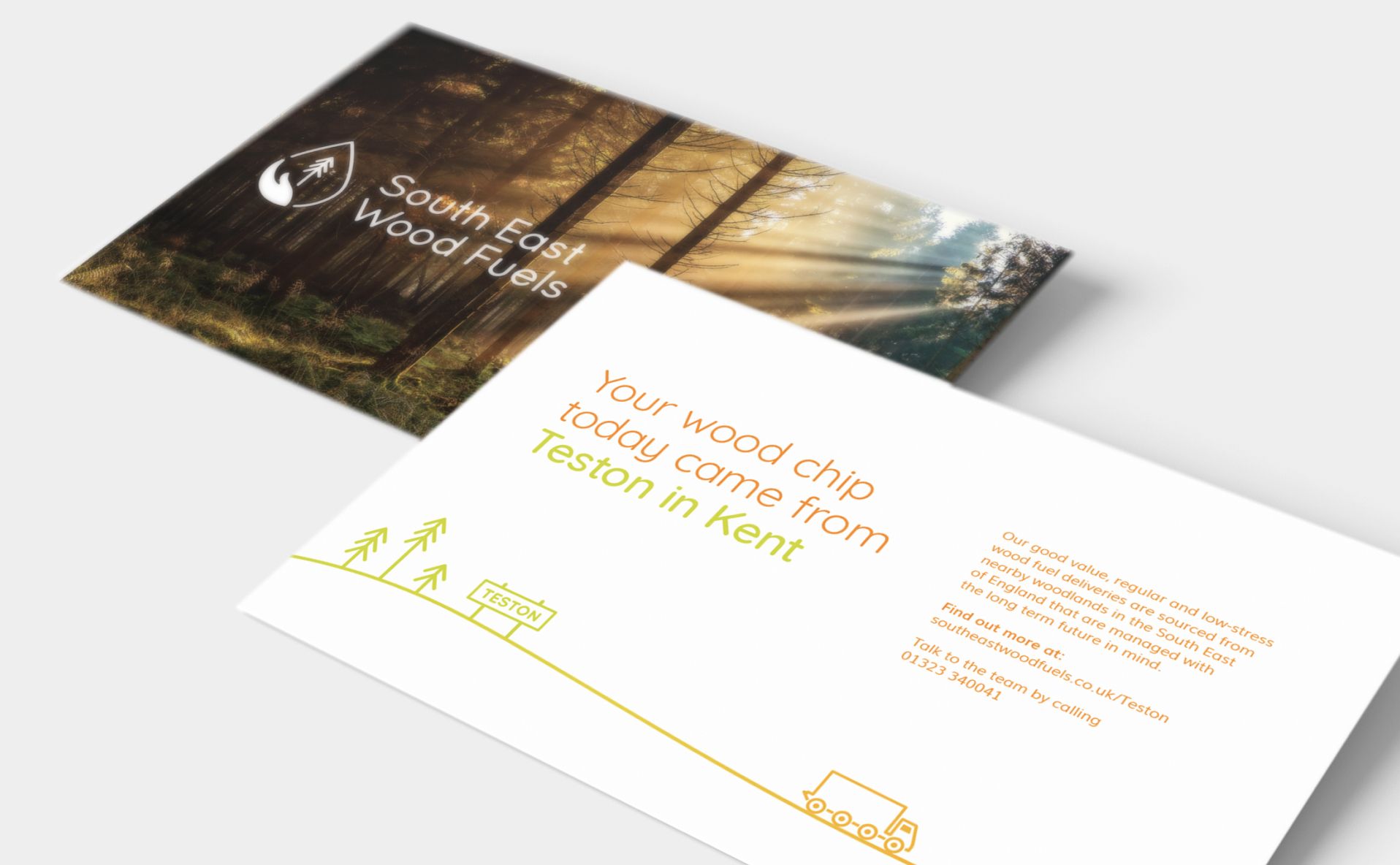
The elements of the logo represent the journey from forest to fuel and how the team goes above and beyond to keep people warm.
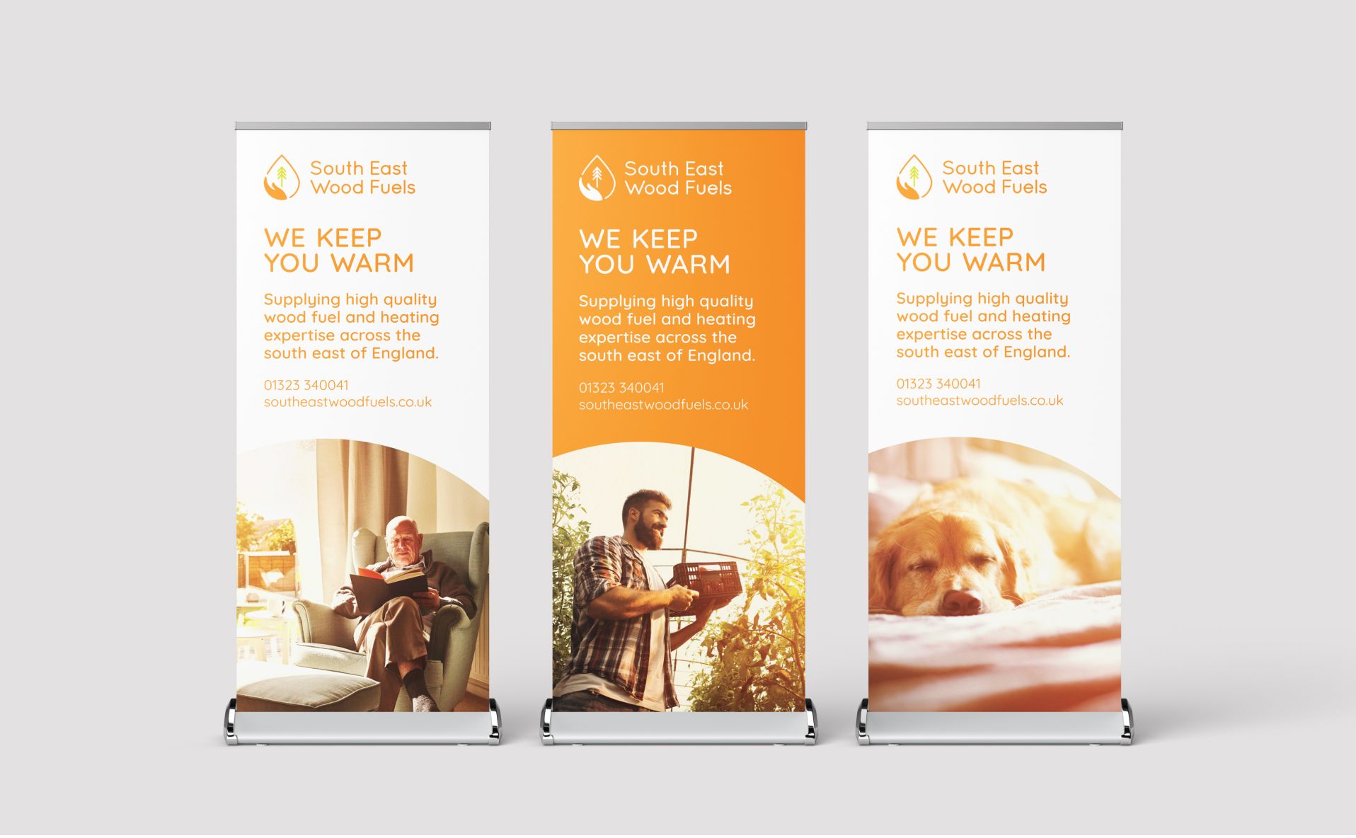
Other ways of visualising warmth were explored through sun-lit photography of relaxing, warm and relaxing spaces. I created a consistent photographic style which brought together the images of their diverse (and sometimes very niche) customers. This was done by providing an image guidelines document and Photoshop filter.
Colour, icons and illustration also picture the green to warm journey, using a nurturing but clean look and feel.
The Strategy workshop was facilitated by associate Strategists Charlie Peverett and Tamsin Bishton who then went on to create and write the South East Wood Fuels brand story, proposition and key messages.


